应用截图
详细介绍
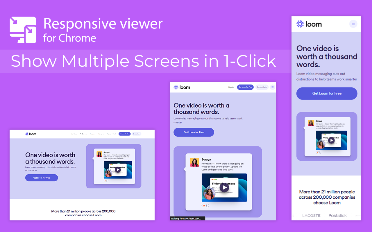
View multiple screens simultaneously With Responsive viewer For Chrome
In 2025, ensuring your website looks flawless across all devices is more important than ever. Don’t let your website look ugly when viewed in different devices, you can use Responsive Viewer for Chrome extension. As a device necessary for developers, you have the ability to display several sizes on the screen at once, which makes testing of work in responsive design faster. With two to three clicks, assess and improve broad site structure across different screens, for the best usability.
Key Features:
Multiple Screens in One View: See all the screen resolutions on one page, from mobile-first to desktop-first, if you want to test responsiveness.
Quick Layout Assessments: Exhibit 2 A time saver delivering layout problems in real time respecting device, screen and orientation.
Customizable Configurations: Make your screens, specific resolutions, and spatial orientations correspond with the intended devices.
Enhanced Development Workflow: Be able to easily identify and address problems regarding responsiveness in order to enhance the design operation.
How to Use:
Install the Extension: To get the Responsive Viewer Chrome Extension, go to Chrome Web Store and install it.
Open the Website or App: Open the website or the application that you wish to and it ready for testing.
Activate Responsive View: In your Chrome bar you will see the icon of Responsive Viewer.
Customize View: Orientation and scaling and resizing options are available to help the user in specific and more detailed forms of testing.
Review and Optimize: Make sure that the same layout appears uniformly in all your displays and adjust your site in terms of how well it is user-friendly on each of the devices.
Test with Ease: To minimize discrepancies in performance across different devices, the configurations have to vary.
Why Use Responsive Viewer?
As was described, the Responsive Viewer is intended to simpl